This guide covers the full syntax of SGL (Structured Graphics Language) as implemented in rsgl. For the formal language specification, see Chapman (2025).
Setup
All examples use dbGetPlot(), which takes a DuckDB
connection and a SGL statement. We’ll load some datasets into an
in-memory DuckDB database to work with.
library(rsgl)
library(duckdb)
#> Loading required package: DBI

con <- dbConnect(duckdb())
dbWriteTable(con, "cars", mtcars)
dbWriteTable(con, "trees", as.data.frame(Orange))

diamonds <- ggplot2::diamonds
diamonds$cut <- as.character(diamonds$cut)
diamonds$color <- as.character(diamonds$color)
diamonds$clarity <- as.character(diamonds$clarity)
dbWriteTable(con, "diamonds", diamonds)
Statement structure
A SGL statement is built from clauses. A minimal statement has three:
visualize, from, and using.
Additional clauses control grouping, scaling, faceting, and titles. The
statement ends with a semicolon (optional when passed as a string to
dbGetPlot()).
visualize
<aesthetic mappings>
from <data source>
[group by <grouping expressions>]
[collect by <collection expressions>]
using <geom expression>
[scale by <scale expressions>]
[facet by <facet expressions>]
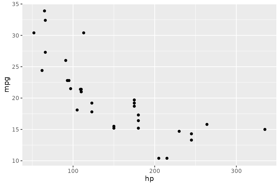
[title <title expressions>]The from clause
The from clause specifies the data source. This is
typically a table name:
dbGetPlot(con, "
  visualize
    hp as x,
    mpg as y
  from cars
  using points
")
A SQL subquery can be used for filtering or transforming data before visualization. The subquery must be enclosed in parentheses:
dbGetPlot(con, "
  visualize
    hp as x,
    mpg as y
  from (
    select hp, mpg
    from cars
    where hp < 200
  )
  using points
")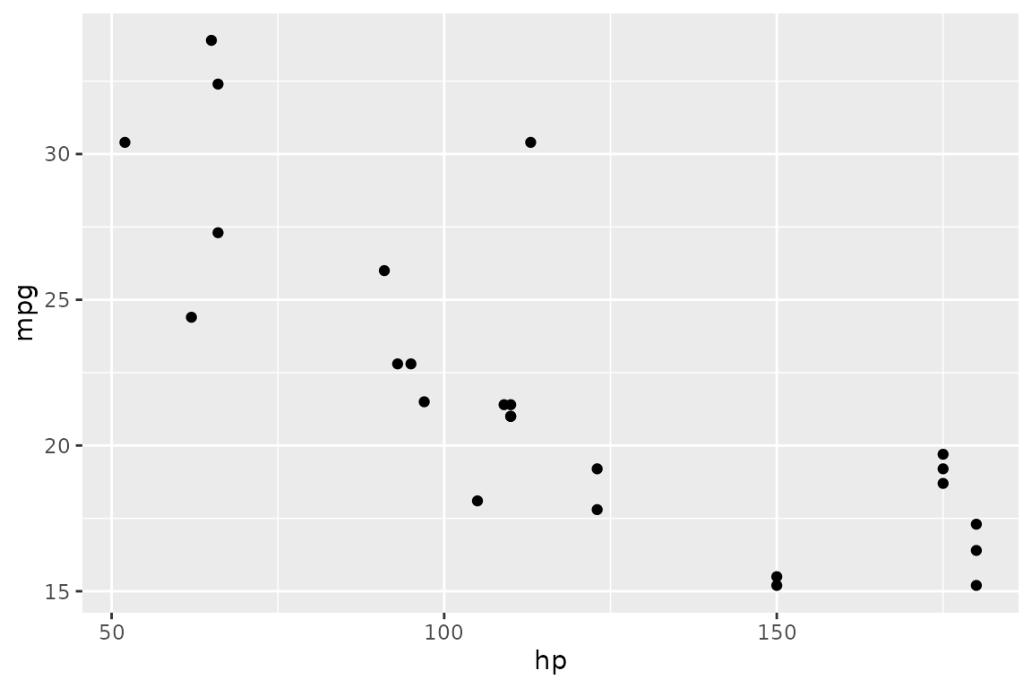
The visualize clause
The visualize clause maps data source columns to
aesthetics. Each mapping has the form
<column> as <aesthetic>.
Positional aesthetics
Cartesian coordinates use x and y:
dbGetPlot(con, "
  visualize
    hp as x,
    mpg as y
  from cars
  using points
")
Polar coordinates use theta (angle) and r
(radius) — see the coordinate systems
section for examples.
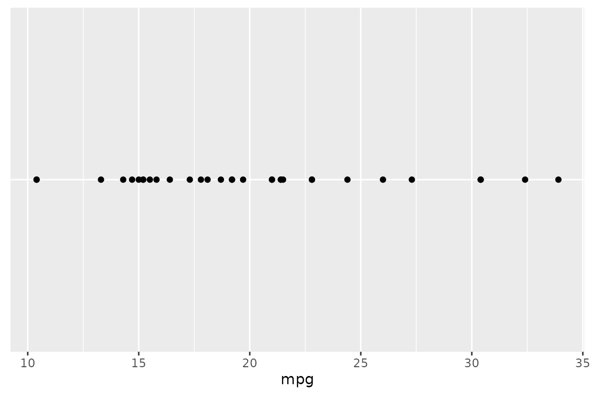
A single positional aesthetic is also valid:
dbGetPlot(con, "
  visualize
    mpg as x
  from cars
  using points
")
Non-positional aesthetics
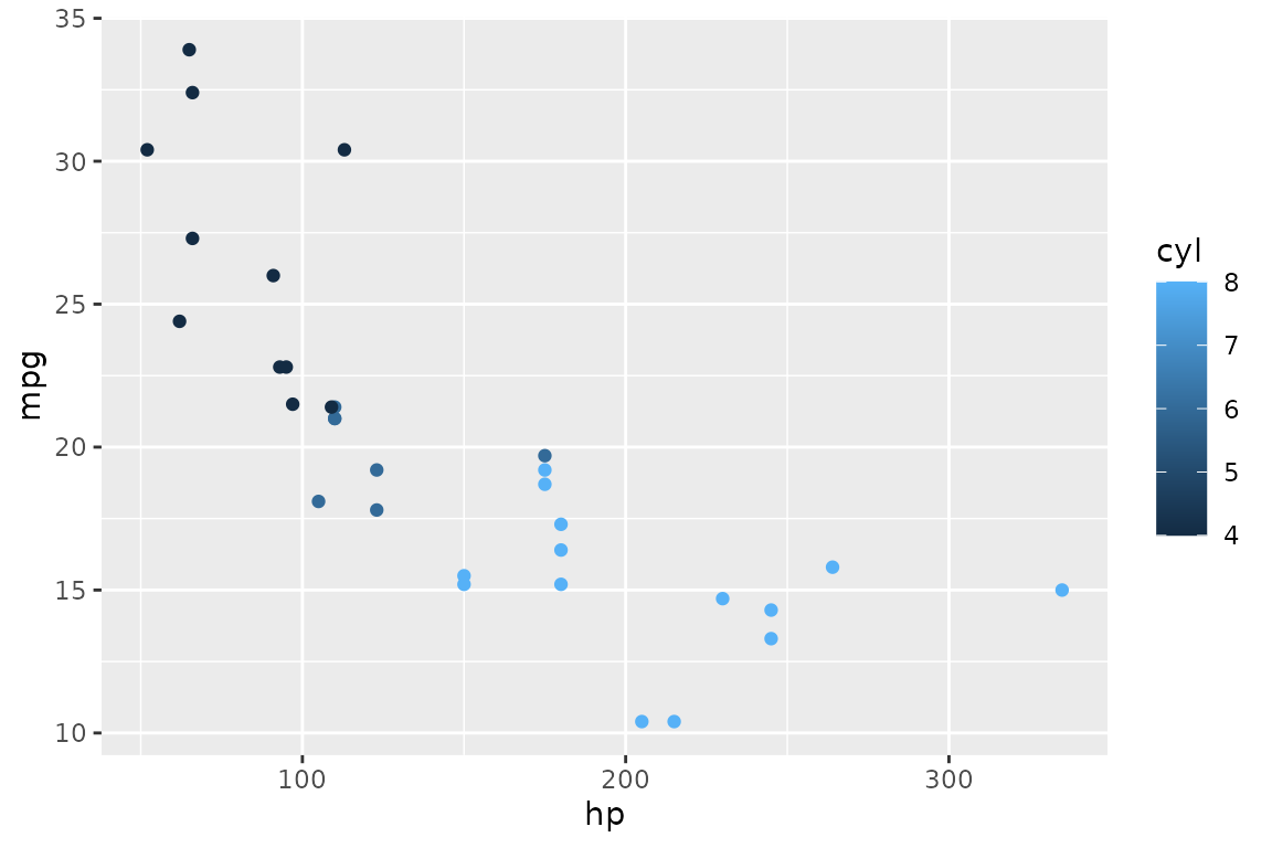
color maps a column to color:
dbGetPlot(con, "
  visualize
    hp as x,
    mpg as y,
    cyl as color
  from cars
  using points
")
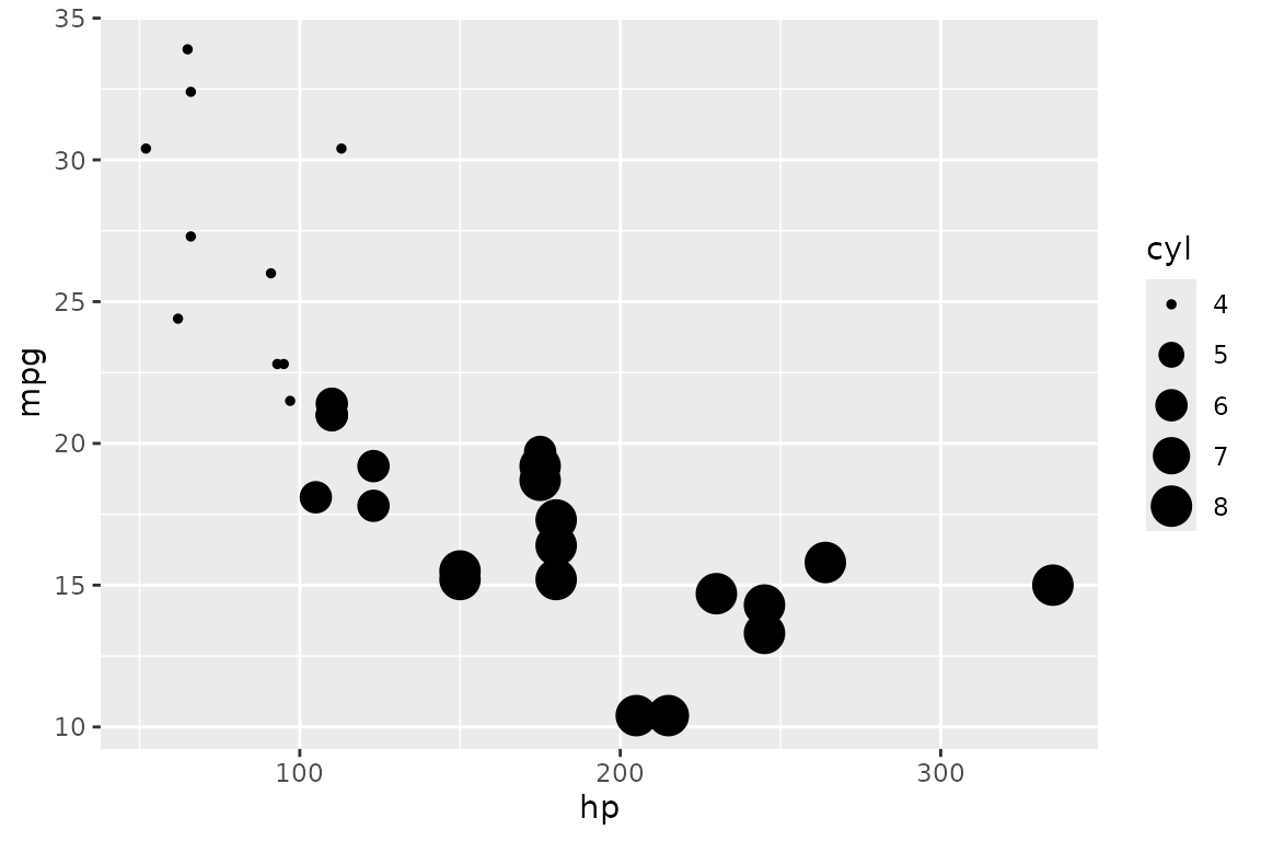
size maps a column to point size:
dbGetPlot(con, "
  visualize
    hp as x,
    mpg as y,
    cyl as size
  from cars
  using points
")
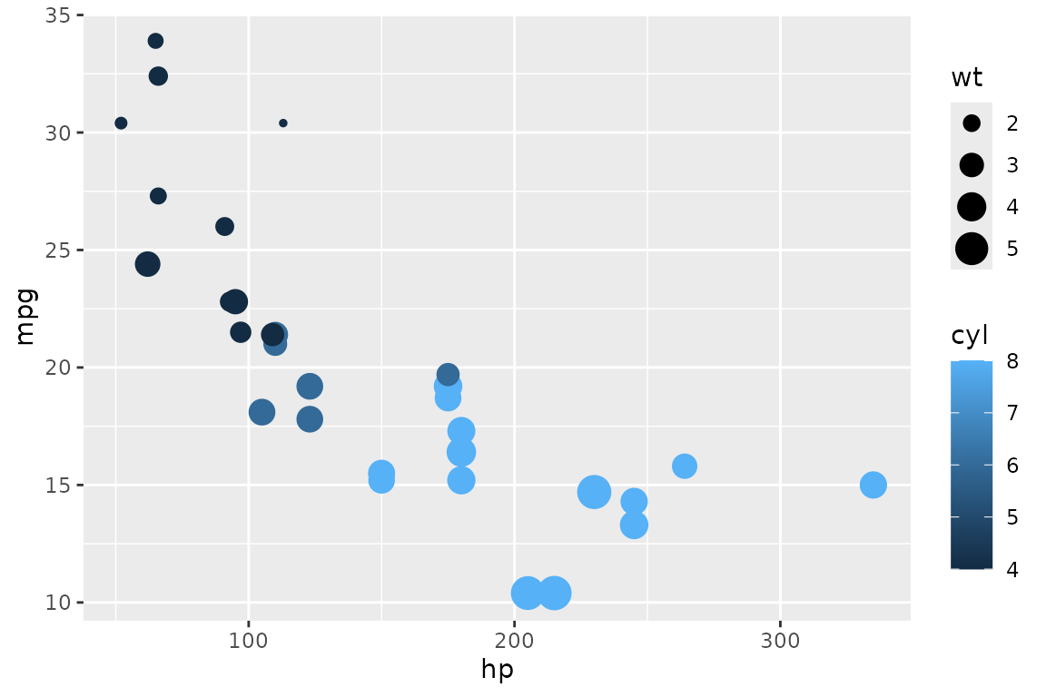
Multiple aesthetics can be combined:
dbGetPlot(con, "
  visualize
    hp as x,
    mpg as y,
    cyl as color,
    wt as size
  from cars
  using points
")
The using clause
The using clause specifies which geometric object (geom)
represents the data. Both singular and plural forms are accepted as
keywords.
Points
points (or point) draws individual points —
one per row:
dbGetPlot(con, "
  visualize
    hp as x,
    mpg as y
  from cars
  using points
")
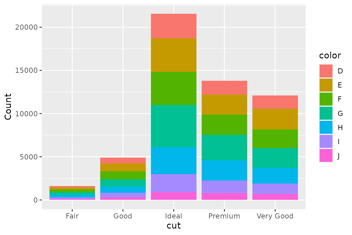
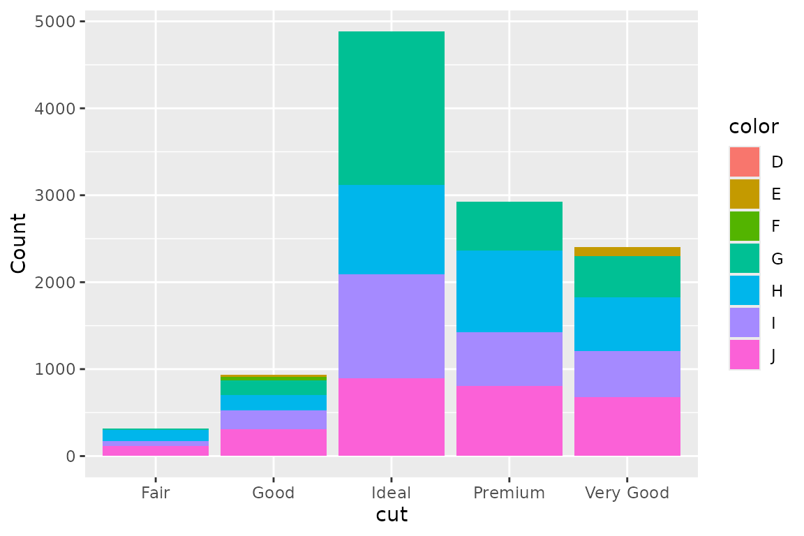
Bars
bars (or bar) draws bar segments. Bars are
stacked by default when a non-positional grouping is present:
dbGetPlot(con, "
  visualize
    cut as x,
    count(*) as y,
    color as color
  from diamonds
  group by
    cut, color
  using bars
")
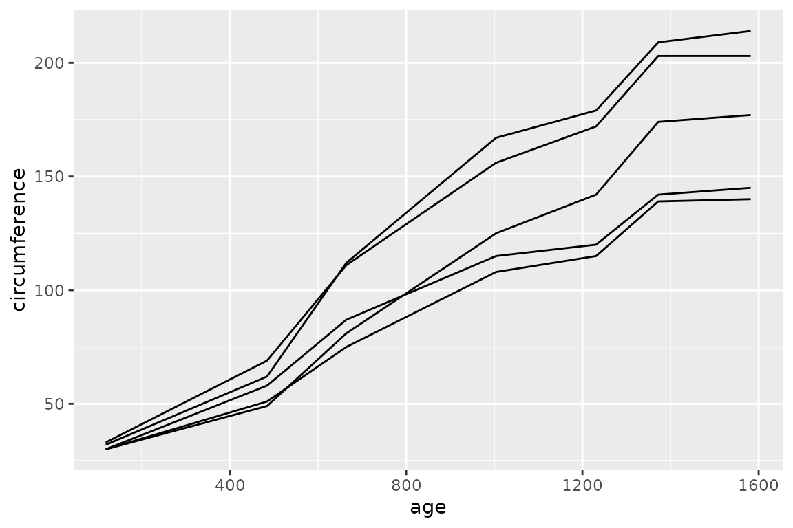
Lines
lines (or line) draws connected lines.
Lines are collective geoms — they represent multiple rows with a single
geometric object:
dbGetPlot(con, "
  visualize
    age as x,
    circumference as y
  from trees
  collect by
    Tree
  using lines
")
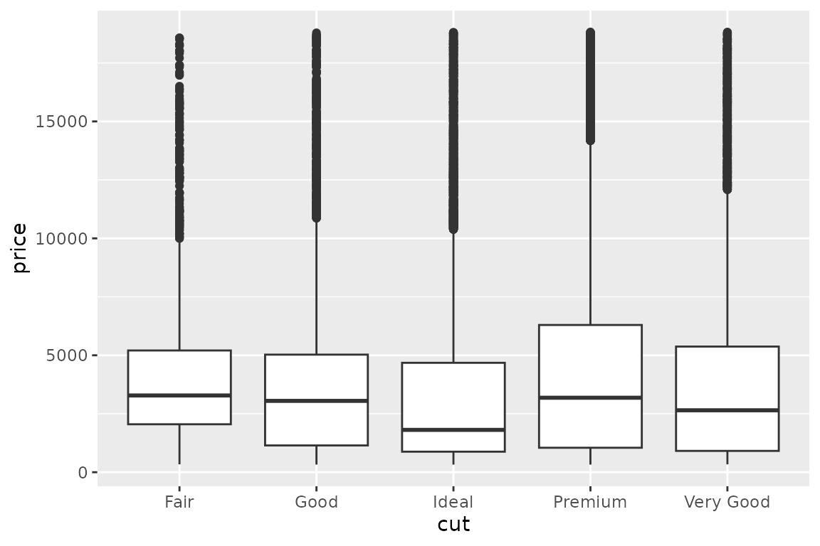
Boxes
boxes (or box) draws box plots. Like lines,
boxes are collective geoms:
dbGetPlot(con, "
  visualize
    cut as x,
    price as y
  from diamonds
  using boxes
")
Column-level transformations and aggregations
SGL supports transformations and aggregations as part of column
expressions in the visualize clause.
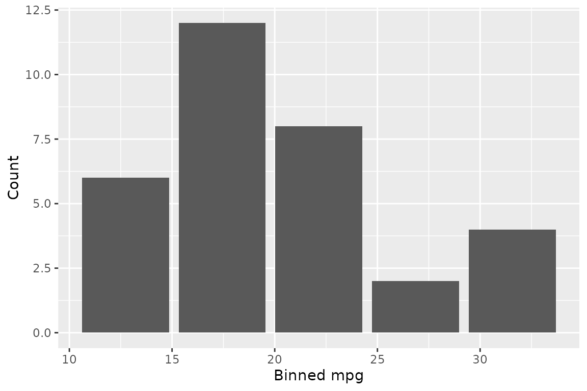
bin()
The bin() transformation groups a continuous column into
discrete bins:
dbGetPlot(con, "
  visualize
    bin(mpg) as x,
    count(*) as y
  from cars
  group by
    bin(mpg)
  using bars
")
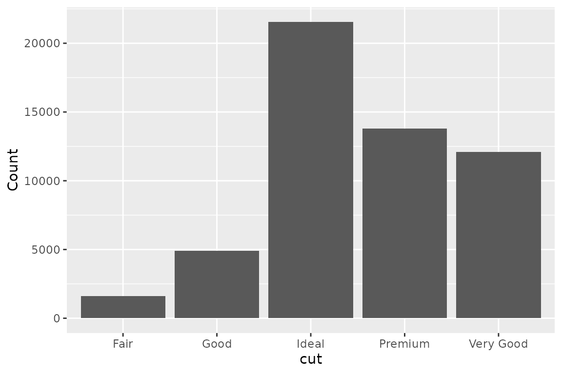
count()
The count(*) aggregation counts rows per group. Any
non-aggregated column in the visualize clause must also
appear in the group by clause — the same rule as SQL:
dbGetPlot(con, "
  visualize
    cut as x,
    count(*) as y
  from diamonds
  group by
    cut
  using bars
")
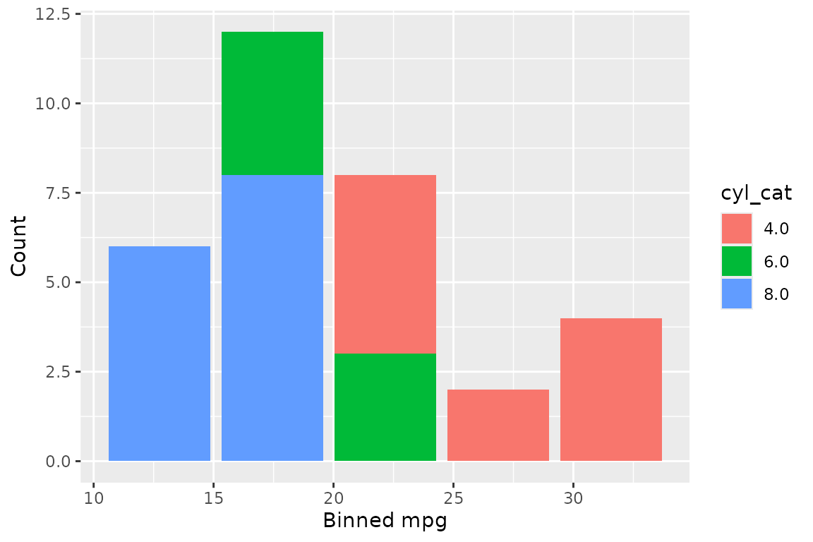
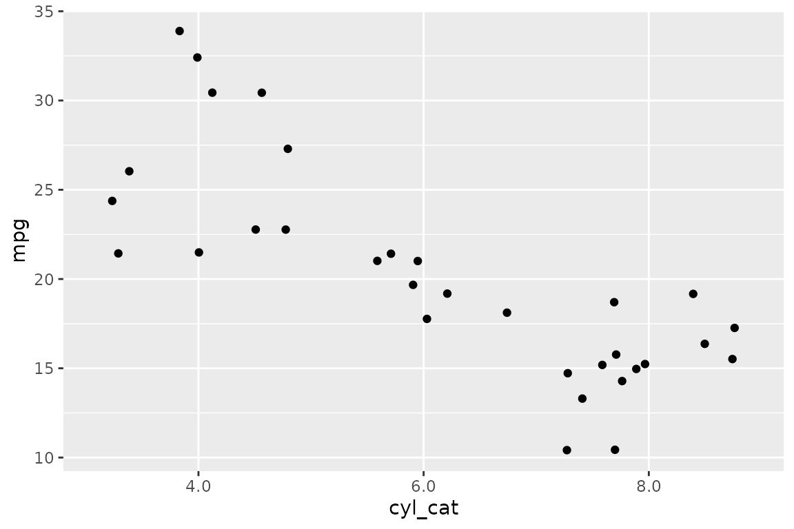
Combining transformations and aggregations
bin() and count(*) can be combined to
produce histograms. Non-positional groupings create stacked
histograms:
dbGetPlot(con, "
  visualize
    bin(mpg) as x,
    count(*) as y,
    cyl_cat as color
  from (
    select
      *,
      cast(cyl as varchar) as cyl_cat
    from cars
  )
  group by
    bin(mpg),
    cyl_cat
  using bars
")
The group by clause
The group by clause specifies grouping expressions for
aggregations. It follows the same semantics as SQL’s
GROUP BY: any non-aggregated expression in the
visualize clause must appear in the group by
clause.
dbGetPlot(con, "
  visualize
    cut as x,
    count(*) as y
  from diamonds
  group by
    cut
  using bars
")
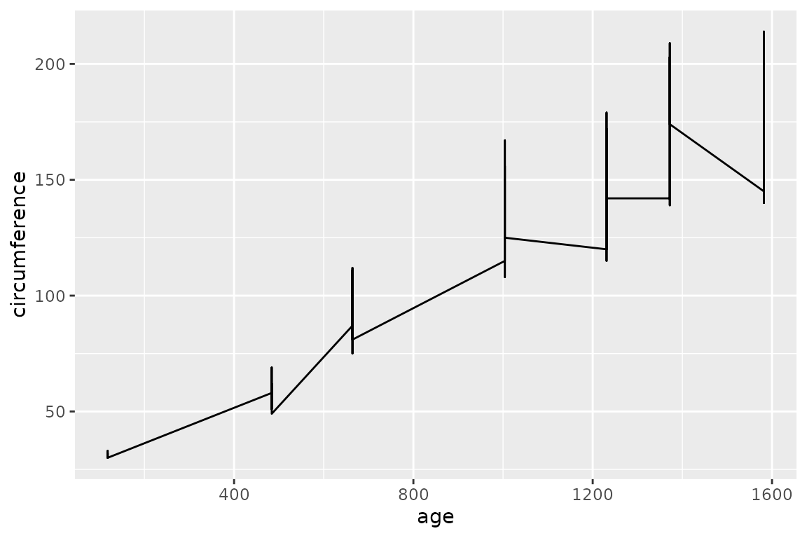
The collect by clause
Collective geoms (lines and boxes) represent multiple rows with a
single geometric object. By default, the collection of rows is
determined implicitly. The collect by clause overrides this
behavior, explicitly specifying which column determines how rows are
grouped into separate geometric objects.
Without collect by, all rows feed into a single
line:
dbGetPlot(con, "
  visualize
    age as x,
    circumference as y
  from trees
  using line
")
With collect by, each unique value of the specified
column produces a separate line:
dbGetPlot(con, "
  visualize
    age as x,
    circumference as y
  from trees
  collect by
    Tree
  using lines
")
Geom qualifiers
Geom qualifiers are keywords placed before the geom name in the
using clause. They modify how the geom represents data.
jittered (points)
Adds random positional variation to points, useful when data has overlapping values:
set.seed(42)
dbGetPlot(con, "
  visualize
    cyl_cat as x,
    mpg as y
  from (
    select mpg, cast(cyl as varchar) as cyl_cat
    from cars
  )
  using jittered points
")
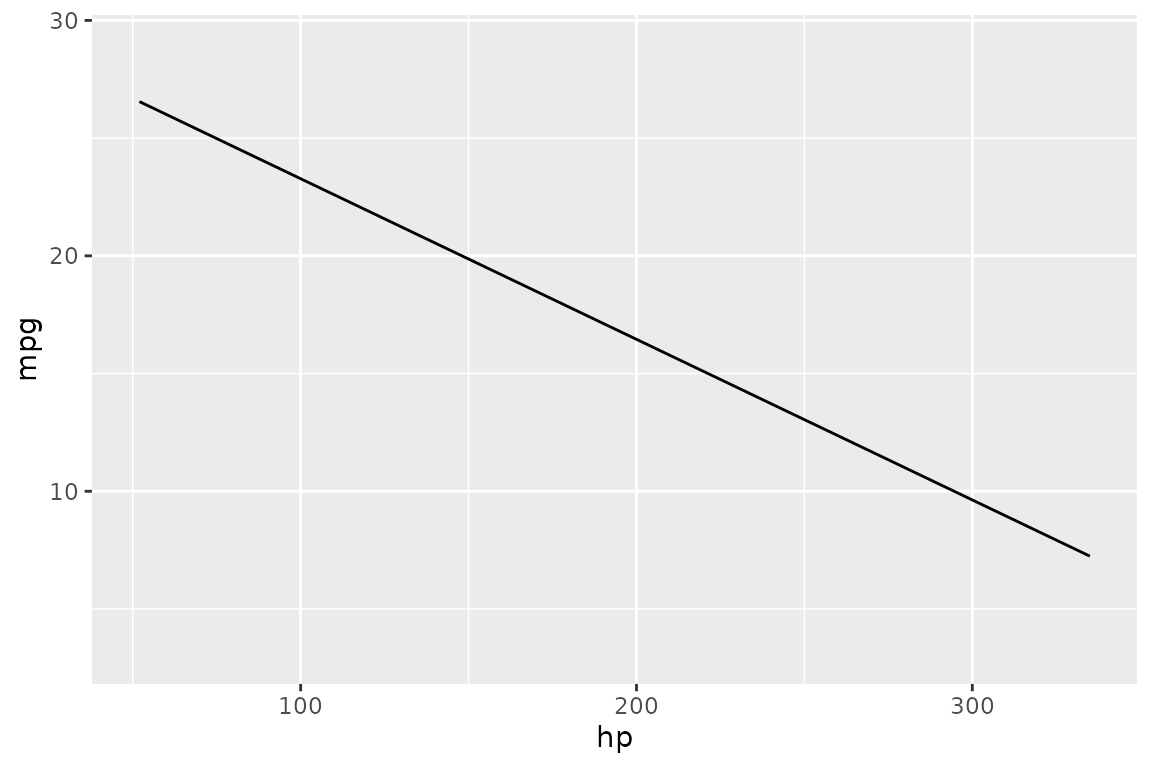
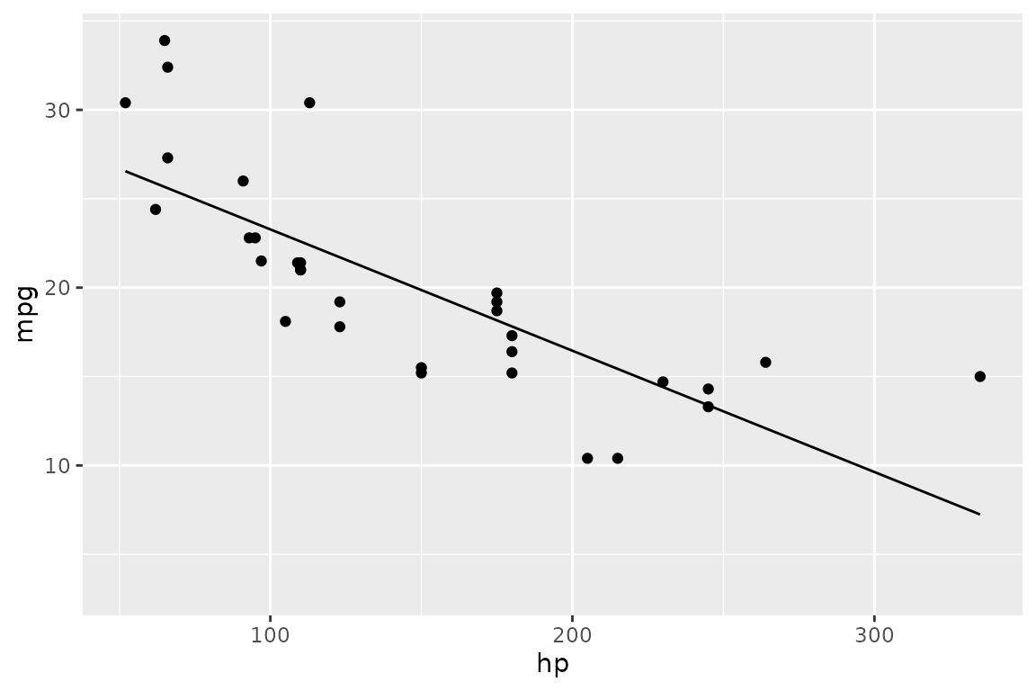
regression (lines)
Fits a linear regression line instead of connecting data points:
dbGetPlot(con, "
  visualize
    hp as x,
    mpg as y
  from cars
  using regression line
")
unstacked (bars)
Positions bars side-by-side instead of stacking them:
dbGetPlot(con, "
  visualize
    cut as x,
    count(*) as y,
    color as color
  from diamonds
  group by
    cut, color
  using unstacked bars
")
The layer operator
Multiple layers of geometric objects can be combined into a single
graphic using the layer keyword. Each layer is a complete
sub-statement with its own visualize, from,
and using clauses:
dbGetPlot(con, "
  visualize
    hp as x,
    mpg as y
  from cars
  using points

  layer

  visualize
    hp as x,
    mpg as y
  from cars
  using regression line
")
Layered geom expressions
When layers share the same data source and aesthetic mapping, a
shorthand syntax avoids repetition. Geom expressions are listed inside
parentheses in the using clause, separated by
layer:
dbGetPlot(con, "
  visualize
    hp as x,
    mpg as y
  from cars
  using (
    points
    layer
    regression line
  )
")
The scale by clause
Each mapped aesthetic has a scale that determines how data values are
mapped to visual properties. Scales default to linear but can be
overridden with the scale by clause.
Log scale
log() applies a base-10 logarithmic scale to an
aesthetic:
dbGetPlot(con, "
  visualize
    hp as x,
    mpg as y
  from cars
  using (
    points
    layer
    regression line
  )
  scale by
    log(x),
    log(y)
")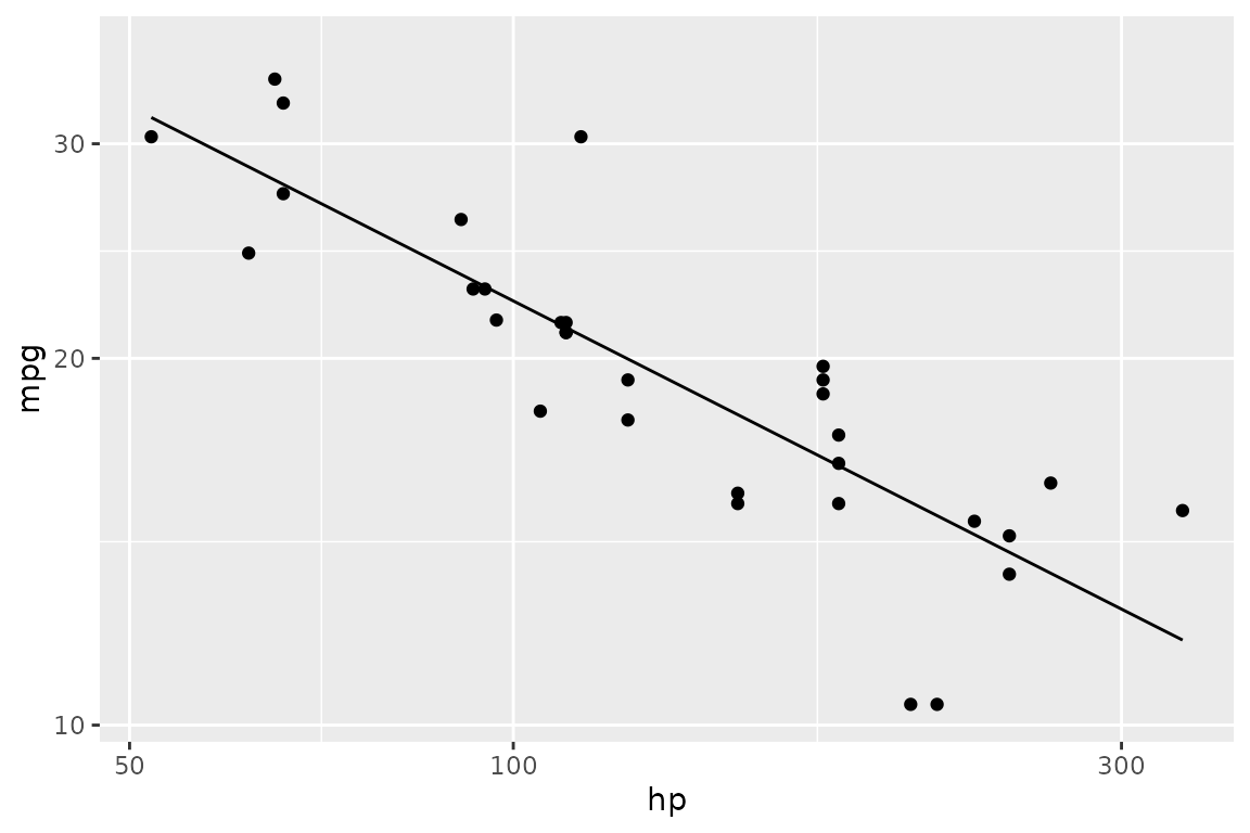
Note that scaling is applied to the aesthetic, not to the data. This
means the regression in the example above is computed on the log-scaled
values. To transform the data itself, use SQL in the from
clause:
dbGetPlot(con, "
  visualize
    log_hp as x,
    log_mpg as y
  from (
    select
      log(hp) as log_hp,
      log(mpg) as log_mpg
    from cars
  )
  using (
    points
    layer
    regression line
  )
")![]()
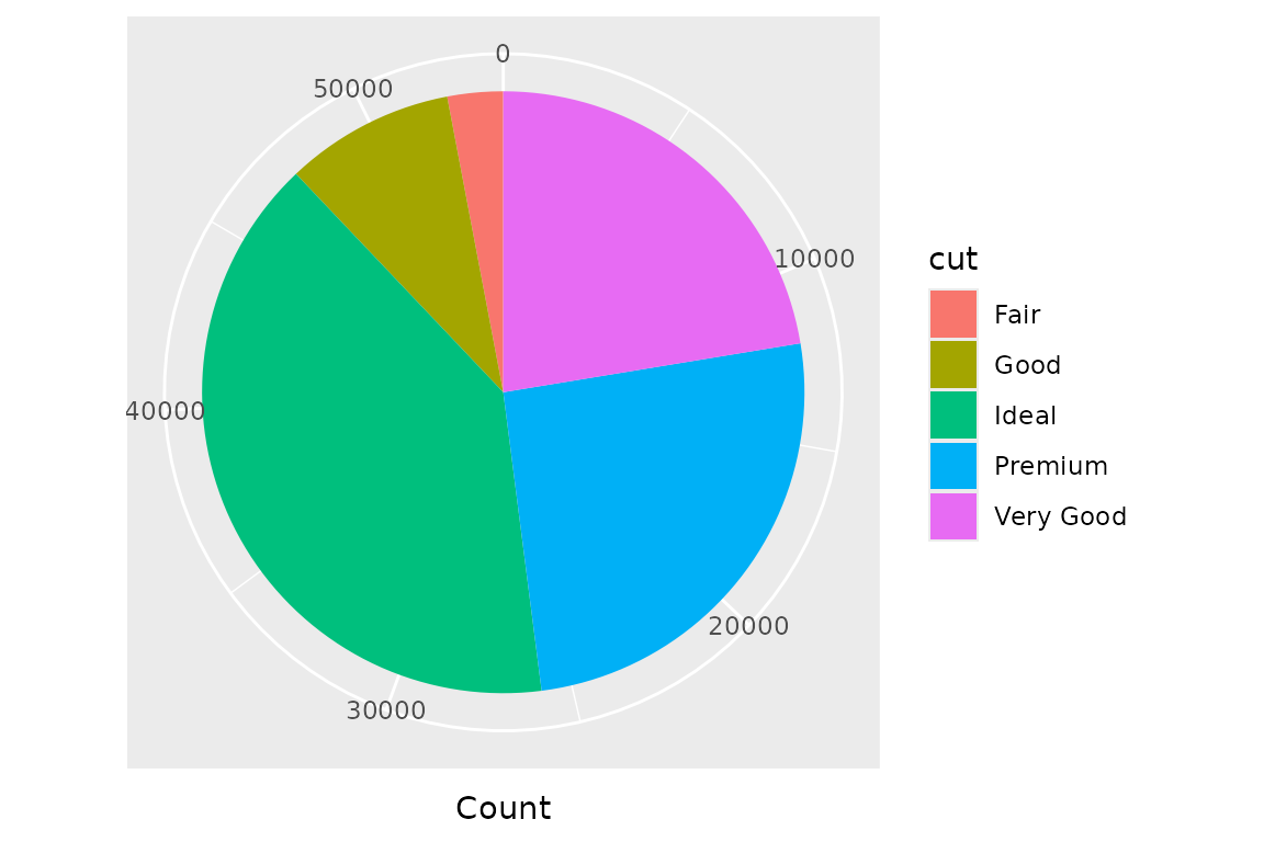
Coordinate systems
The coordinate system is inferred from the positional aesthetics in
the visualize clause. x and y
imply Cartesian coordinates. theta and r imply
polar coordinates.
A pie chart is a stacked bar chart rendered in polar coordinates:
dbGetPlot(con, "
  visualize
    count(*) as theta,
    cut as color
  from diamonds
  group by
    cut
  using bars
")
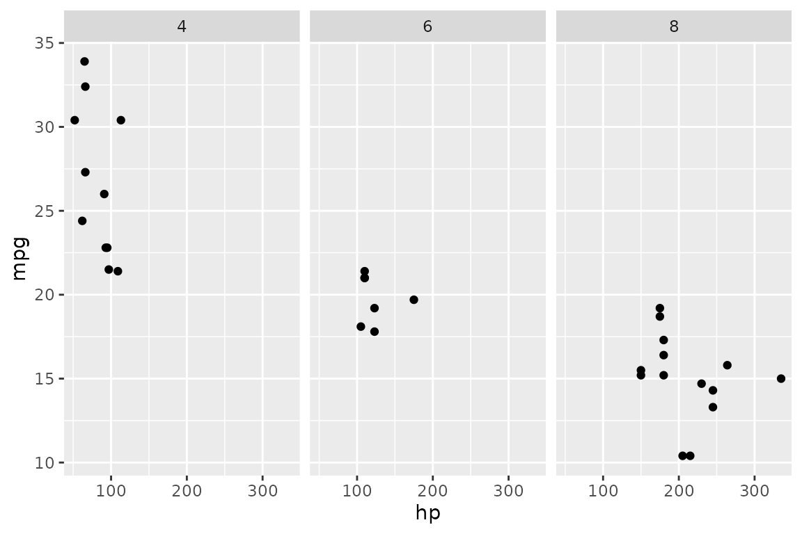
The facet by clause
Faceting generates small multiples — separate panels for each unique value of a column. A single facet expression produces horizontal panels by default:
dbGetPlot(con, "
  visualize
    hp as x,
    mpg as y
  from cars
  using points
  facet by
    cyl
")
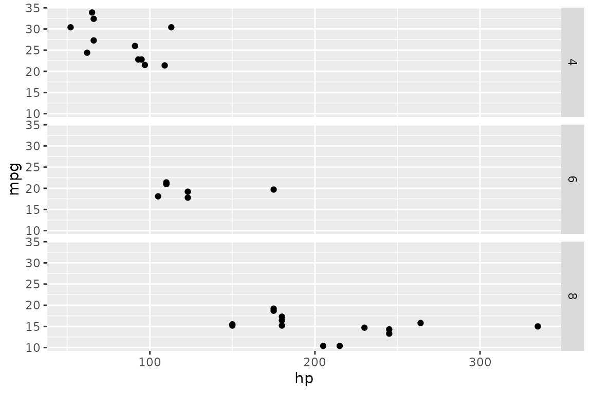
The orientation can be changed with the vertically
keyword:
dbGetPlot(con, "
  visualize
    hp as x,
    mpg as y
  from cars
  using points
  facet by
    cyl vertically
")
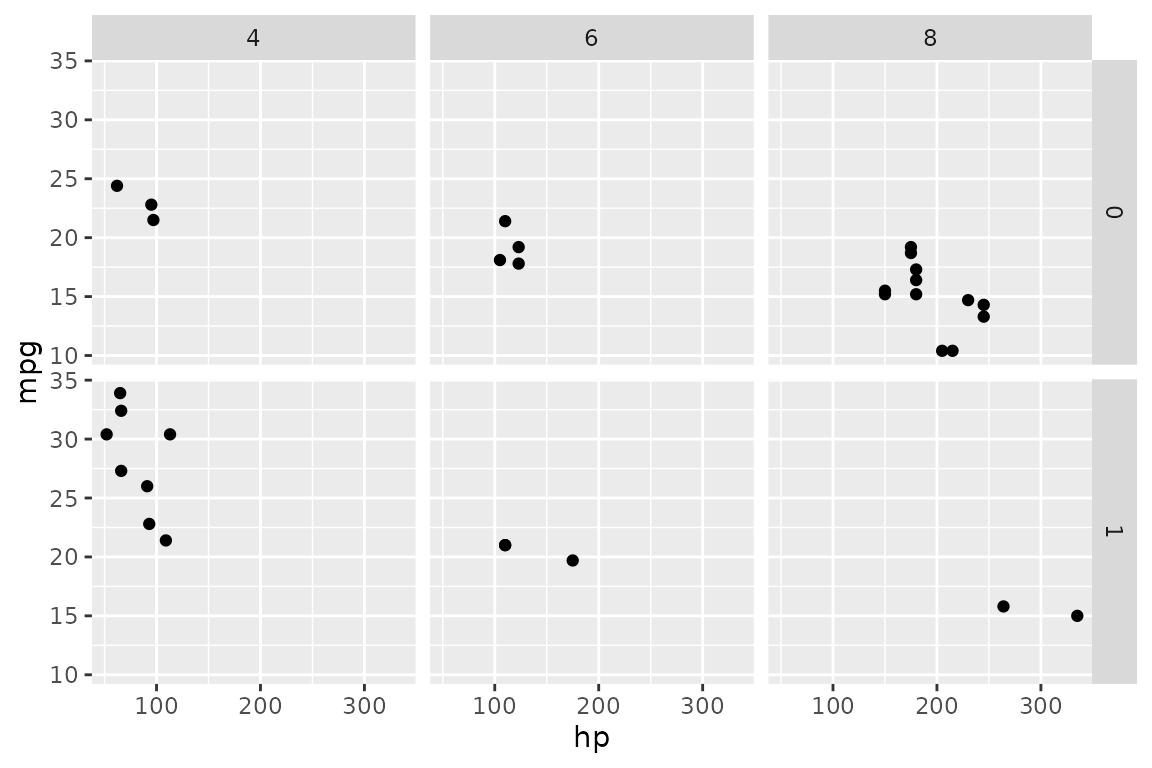
Two facet expressions produce a grid — one varies horizontally, the other vertically:
dbGetPlot(con, "
  visualize
    hp as x,
    mpg as y
  from cars
  using points
  facet by
    cyl,
    am
")
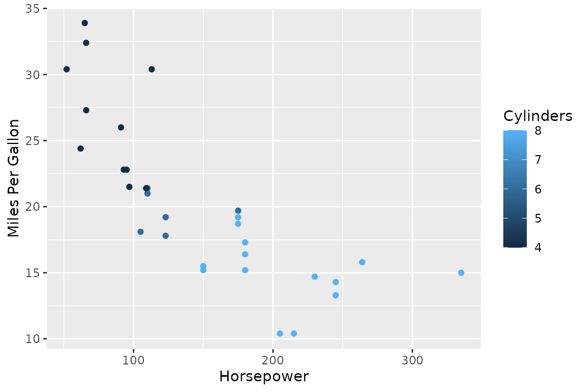
The title clause
Axis and legend titles are automatically derived from aesthetic
mappings. The title clause overrides these defaults:
dbGetPlot(con, "
  visualize
    hp as x,
    mpg as y,
    cyl as color
  from cars
  using points
  title
    x as 'Horsepower',
    y as 'Miles Per Gallon',
    color as 'Cylinders'
")