Database Setup
The examples on this page will use an in-memory DuckDB database loaded with data. Multiple datasets are used and the page is organized by the dataset being analyzed.
library(rsgl)
#>
#> Attaching package: 'rsgl'
#> The following objects are masked from 'package:datasets':
#>
#>     cars, trees
library(duckdb)
#> Loading required package: DBI

con <- dbConnect(duckdb())
#> duckdb is keeping downloaded extensions in a temporary directory:
#> ℹ /tmp/Rtmpl6KvuJ/duckdb/extensions
#> This is removed when the R session ends, so extensions are re-downloaded each session.
#> ℹ To keep them, point `options(duckdb.extension_directory =)` or the `DUCKDB_EXTENSION_DIRECTORY` environment variable at a permanent path.
Cars
Setup
dbWriteTable(con, "cars", cars)
dbGetQuery(con, "
  select *
  from cars
  limit 5
")
#>   car_id horsepower miles_per_gallon origin year
#> 1      1        130               18    USA 1970
#> 2      2        165               15    USA 1970
#> 3      3        150               18    USA 1970
#> 4      4        150               16    USA 1970
#> 5      5        140               17    USA 1970
Example Plots
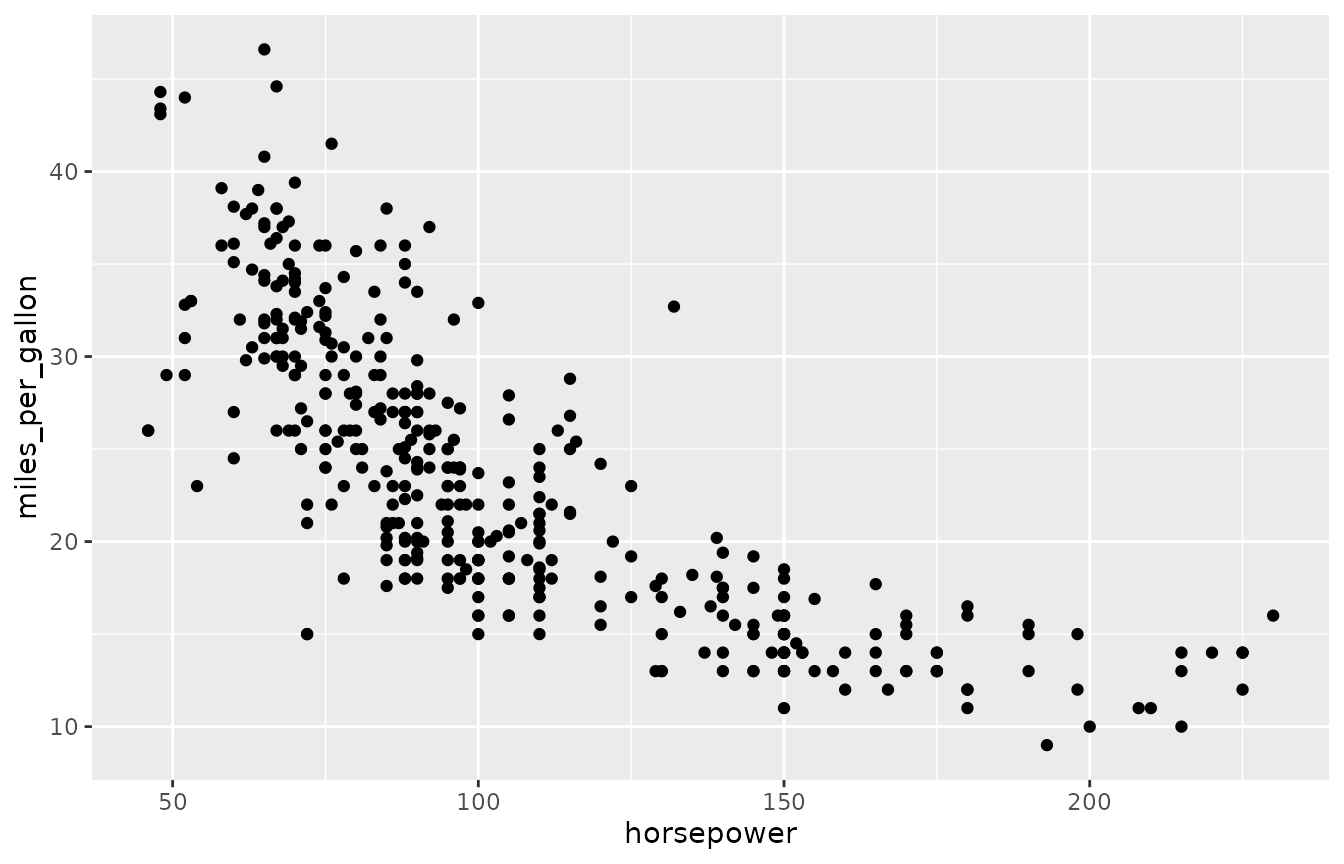
dbGetPlot(con, "
  visualize
    horsepower as x,
    miles_per_gallon as y
  from cars
  using points
")
dbGetPlot(con, "
  visualize
    horsepower as x,
    miles_per_gallon as y
  from cars
  using (
    points
    layer
    regression line
  )
  facet by
    origin
  scale by
    log(x),
    log(y)
")
dbGetPlot(con, "
  visualize
    count(*) as theta,
    origin as color
  from cars
  group by
    origin
  using bars
  title
    theta as 'Number of Cars',
    color as 'Country of Origin'
")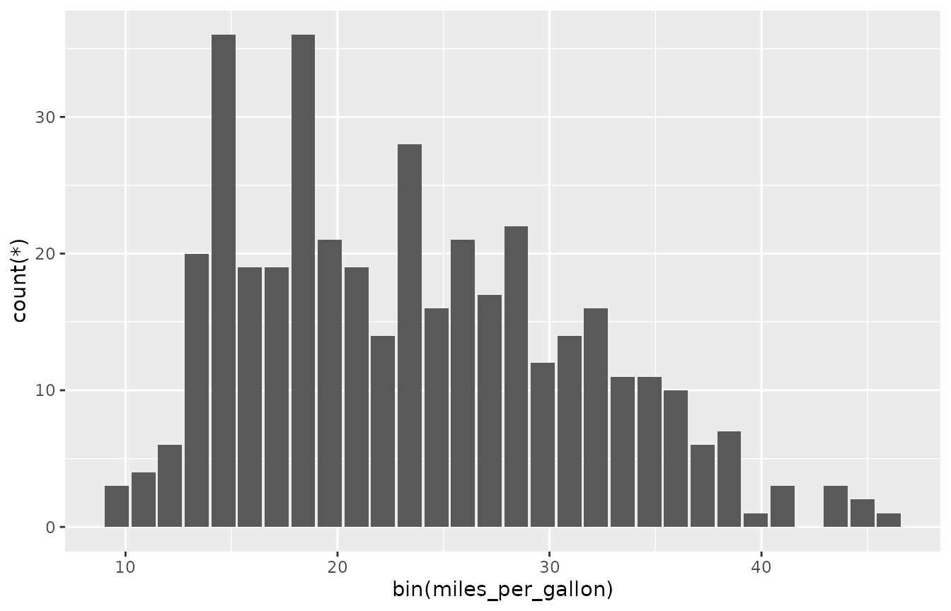
dbGetPlot(con, "
  visualize
    bin(miles_per_gallon) as x,
    count(*) as y
  from cars
  group by
    bin(miles_per_gallon)
  using bars
")
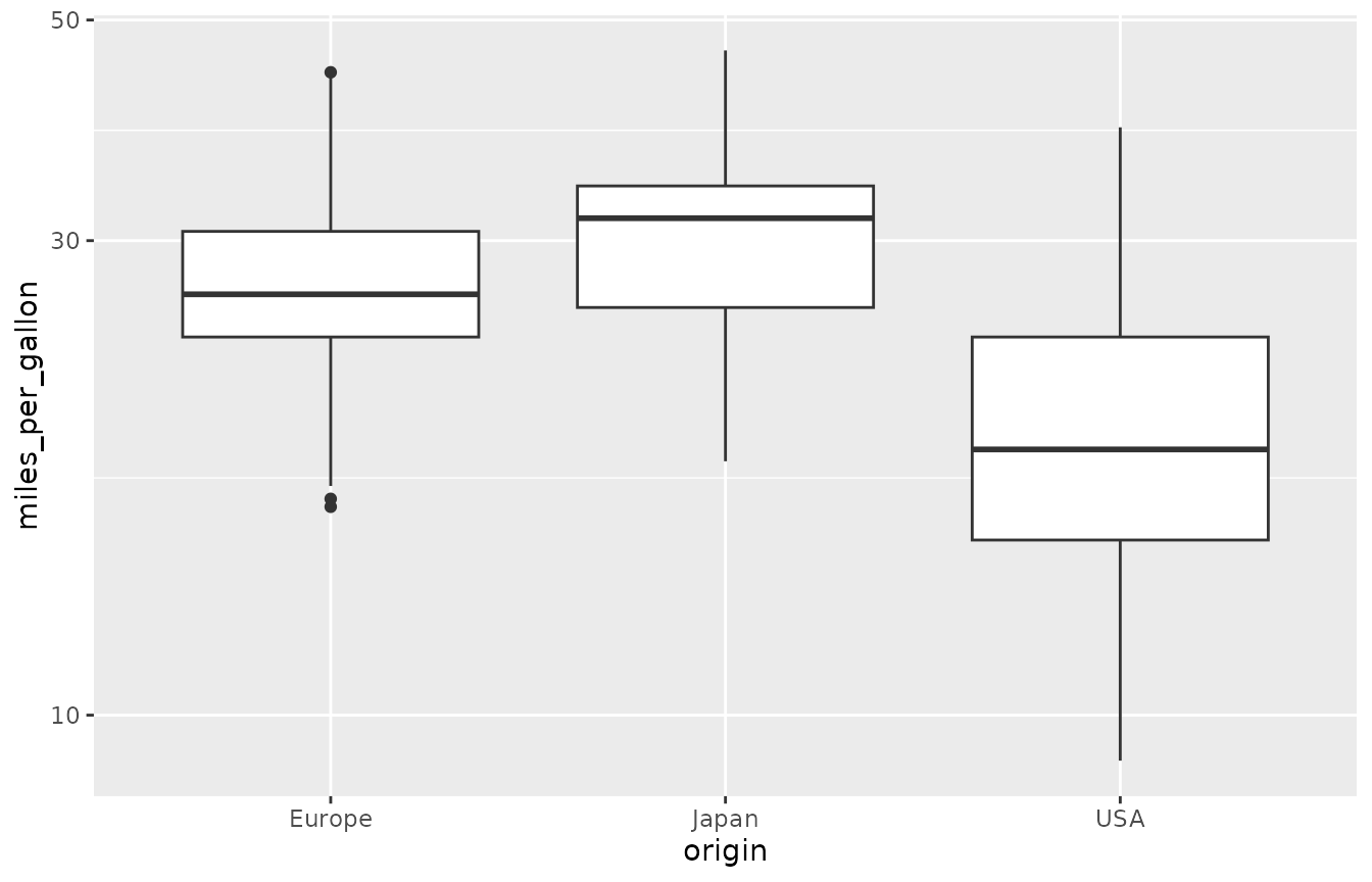
dbGetPlot(con, "
  visualize
    origin as x,
    miles_per_gallon as y
  from cars
  using boxes
  scale by
    log(y)
")
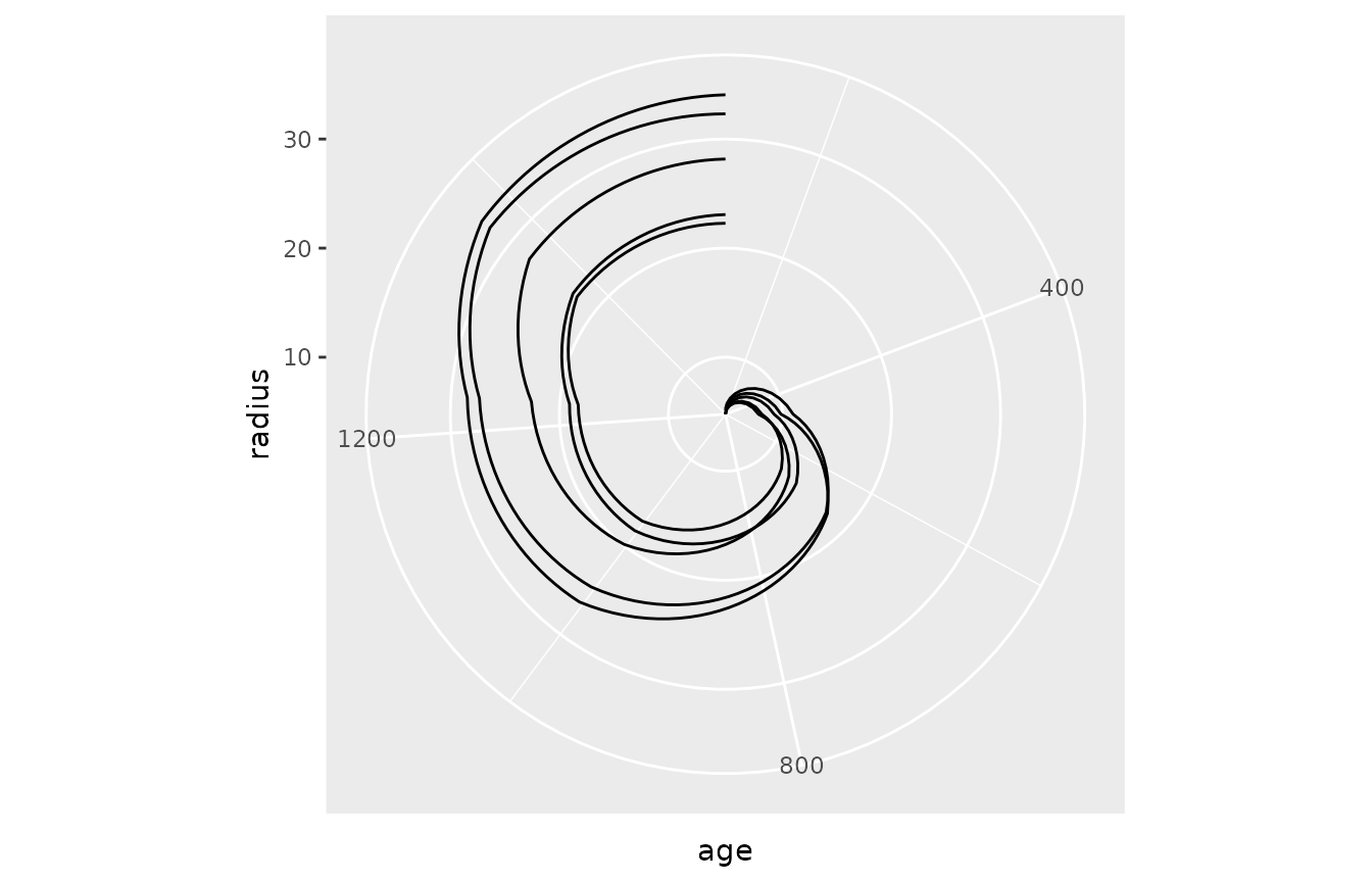
Trees
Setup
dbWriteTable(con, "trees", trees)
dbGetQuery(con, "
  select *
  from trees
  limit 5
")
#>   tree_id  age circumference
#> 1       1  118            30
#> 2       1  484            58
#> 3       1  664            87
#> 4       1 1004           115
#> 5       1 1231           120